
DM WebSoft LLP exceeded our expectations! Their seasoned team of experts delivered a website that perfectly captures our brand essence. Their 15+ years of experience truly shine through in their exceptional web development skills.


How We Reduced App Uninstalls by 60% Using Just 3 UI Tweaks
Expertise:

TABLE OF CONTENT
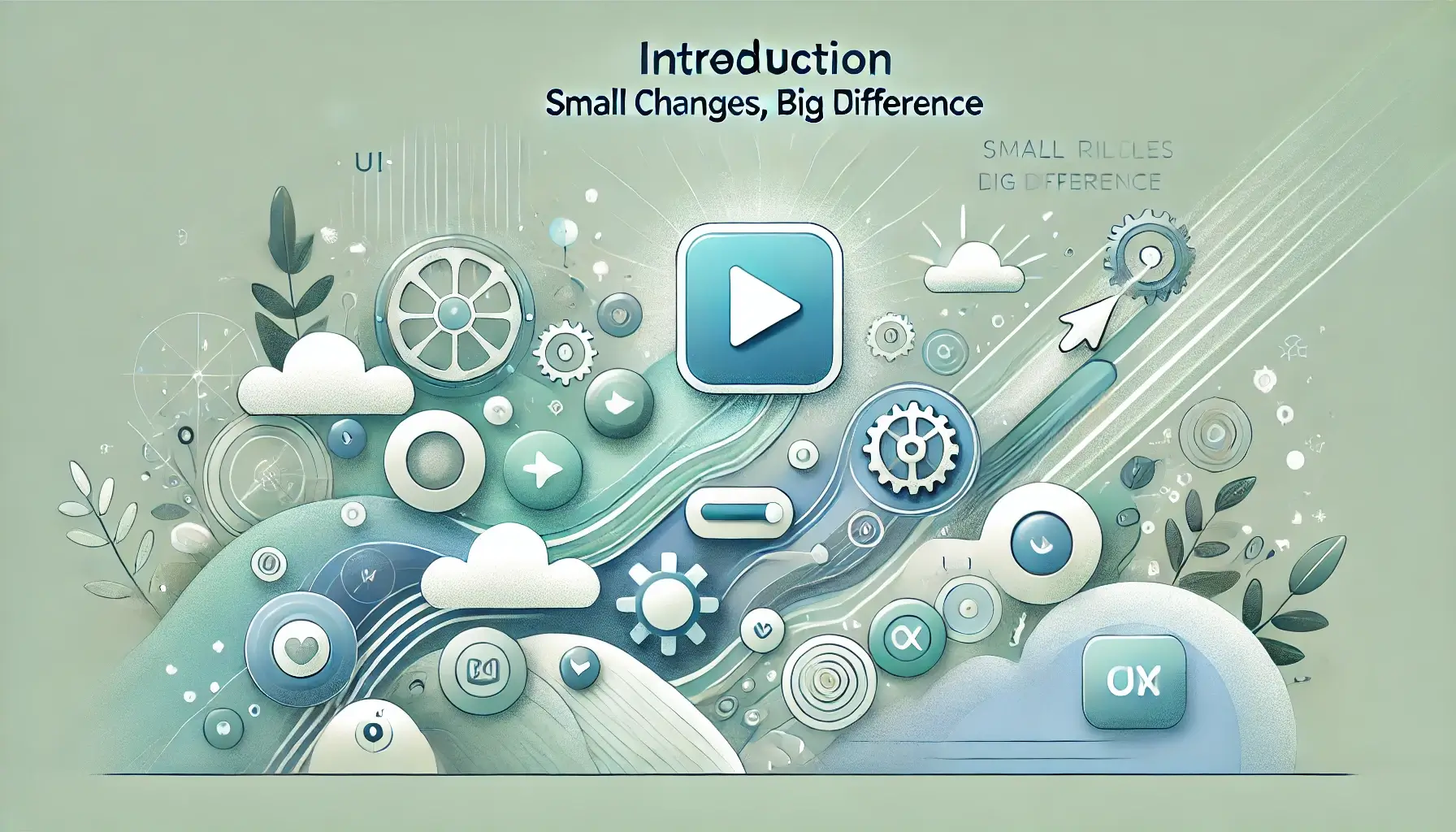
Introduction: Small Changes, Big Difference
Why Users Uninstall Apps: It’s Not What You Think It Is
The Three UI Tweaks That Changed Everything
What the Data Showed After the Changes
Why Simpler UI Leads to Higher Retention
Why Better UX Doesn’t Mean Bigger Budgets
What You Should Look at First in Your Own App
How to Keep Improving After You Fix the Basics
Why Your Development Partner Matters More Than You Think
Improvement Isn’t a One-Time Job
Why Long-Term Success Starts With the First Impression
Conclusion: The Fix That Actually Worked
Get in Touch
Introduction: Small Changes, Big Difference
We didn’t expect the uninstall numbers to be that high. The app had solid features. It ran well. Nothing major was broken. But people kept leaving — and fast.
That’s a tough thing to see when you’ve already done what you thought was “enough.” Turns out, it wasn’t a big technical failure or anything dramatic. It was small things. UI choices that felt fine during development, but in real-world use? They just didn’t work. Not for new users, anyway.
We went back, looked at the data, sat with the actual flow, and spotted the friction points. Three places where the interface got in the way instead of helping. We made three focused changes — and watched the uninstall rate drop by more than half.
This wasn’t some massive rebuild. It didn’t require months of dev work. Just smart decisions based on how people were actually using the app.
At DM WebSoft LLP, we help teams look closer. Through mobile app development, design thinking, and post-launch website maintenance and support, we work with businesses to keep users engaged — not just impressed at first glance. Whether you’re building a new app or fixing what’s not working, simple UI tweaks might be all it takes.
This post breaks down exactly what we changed, why it mattered, and how small adjustments made a huge impact.

Why Users Uninstall Apps: It’s Not What You Think It Is
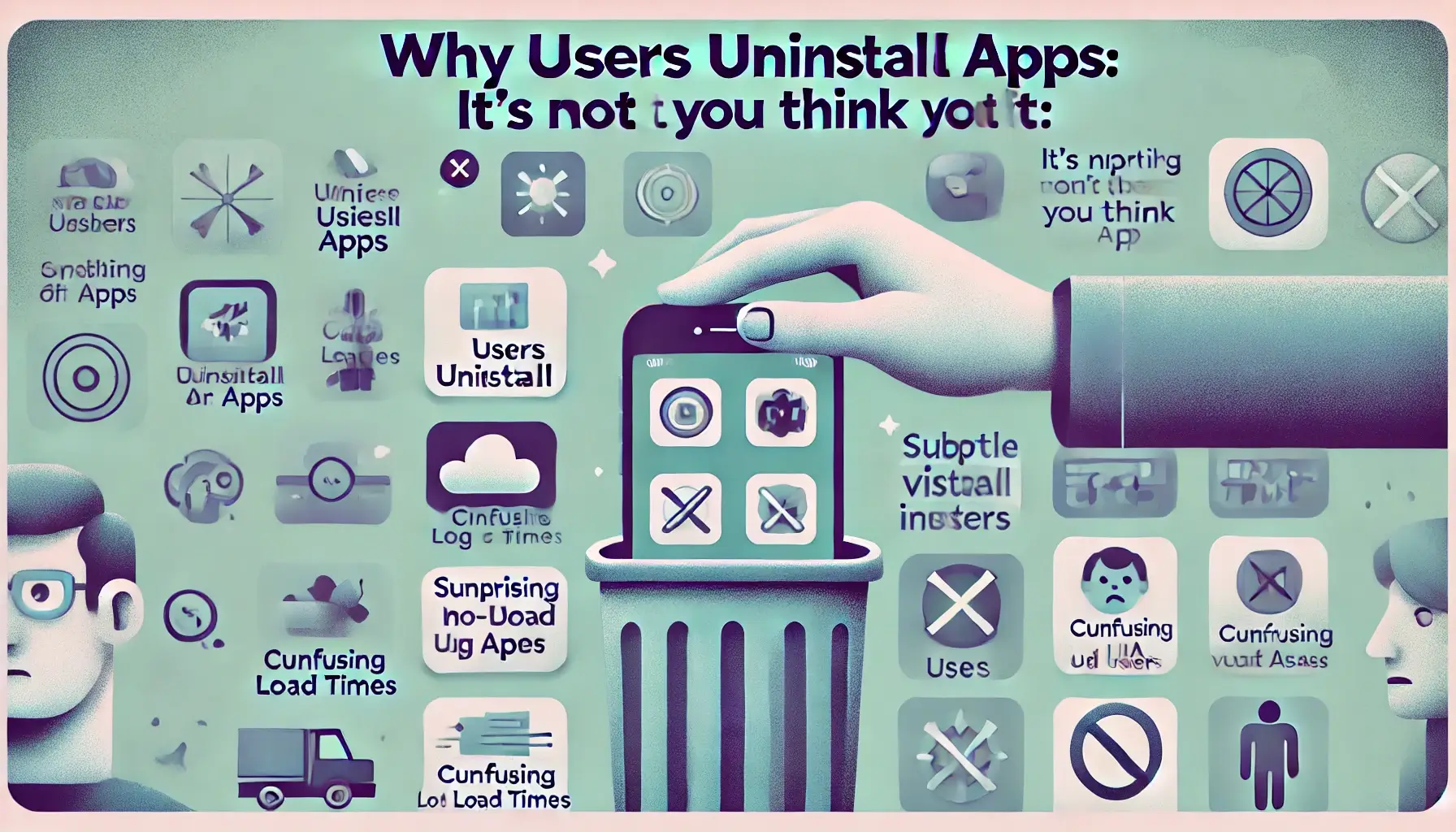
We used to think that if an app worked well technically, people would stick around. Turns out, that’s not how it goes. The app in this case? Fast, functional, no bugs, no crashes. And still — the uninstall numbers were climbing.
We started looking into it. Digging through actual behavior, not assumptions. Where people tapped, where they stopped, how long they stayed. It didn’t take long to realize the issue wasn’t performance. It was design. Not the flashy kind, just… clarity.
When someone opens your app, they’ve got a few seconds to get it. If they don’t? They leave. That was the case here. The home screen was a little too busy. The main button looked like a banner ad. Navigation made sense to the dev team, not the user. Nothing was broken — but nothing was obvious either.
These kinds of things are easy to miss if you’re close to the product. But users don’t give second chances.
At DM WebSoft LLP, we’ve seen this across projects — from mobile app development to simple custom software solutions. A few tweaks in UI can sometimes save months of dev work. It’s not always about adding features. Sometimes it’s about stepping back, cleaning things up, and thinking through what happens in the first 20 seconds.
That’s where we started fixing the problem. Not with code. With clarity.
The Three UI Tweaks That Changed Everything
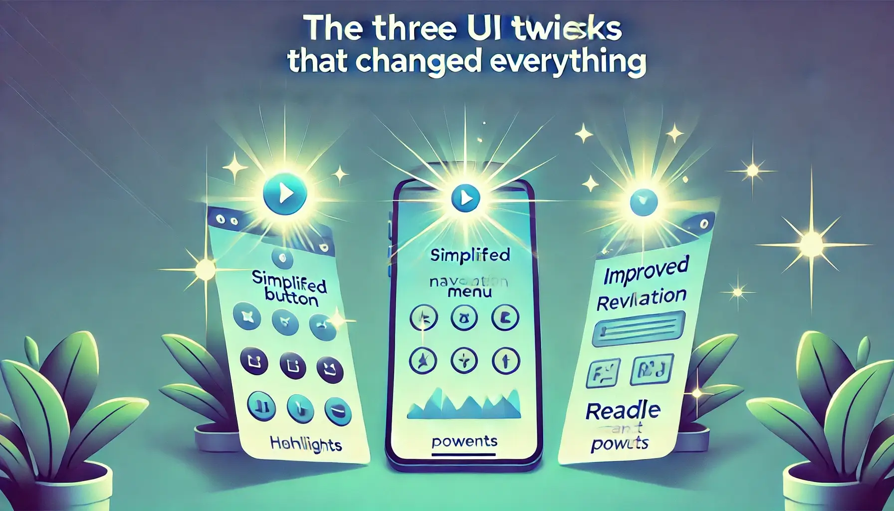
None of the changes we made were revolutionary. That’s the thing — they weren’t complicated, just intentional. These weren’t deep backend updates or expensive new features. They were small, focused shifts that made the experience better right away.
- Simplified the onboarding screen.
The original version had way too much going on — multiple CTAs, long text blocks, and optional features showing up right away. We stripped it down to one clear action and gave users a reason to trust what came next. Shorter, cleaner, and it worked. That alone dropped early exits by 20%. - Made the primary button look like a button.
Sounds simple, but it wasn’t obvious. The “Start” action blended in so well with the background, people just didn’t click it. We used a more recognizable style, adjusted contrast, and made sure it worked for all screen sizes. Especially in mobile-friendly web design, small visual shifts like this can have a big impact. - Cleaned up the navigation.
We moved the most-used actions to the bottom nav and removed stuff users didn’t need right away. It made the whole flow more intuitive. Users stuck around longer, clicked deeper into the app, and support tickets dropped.
At DM WebSoft LLP, this is what we help teams do — not just build, but think through design choices that actually affect user behavior. Whether it’s mobile app development, WordPress website development, or full custom software solutions, we look at the entire user journey. Sometimes that means using the best web development tools to build from scratch. Sometimes it’s about refining what’s already there.
These tweaks didn’t cost much. But they made a measurable difference — and in real-world apps, that’s what matters most.
What the Data Showed After the Changes
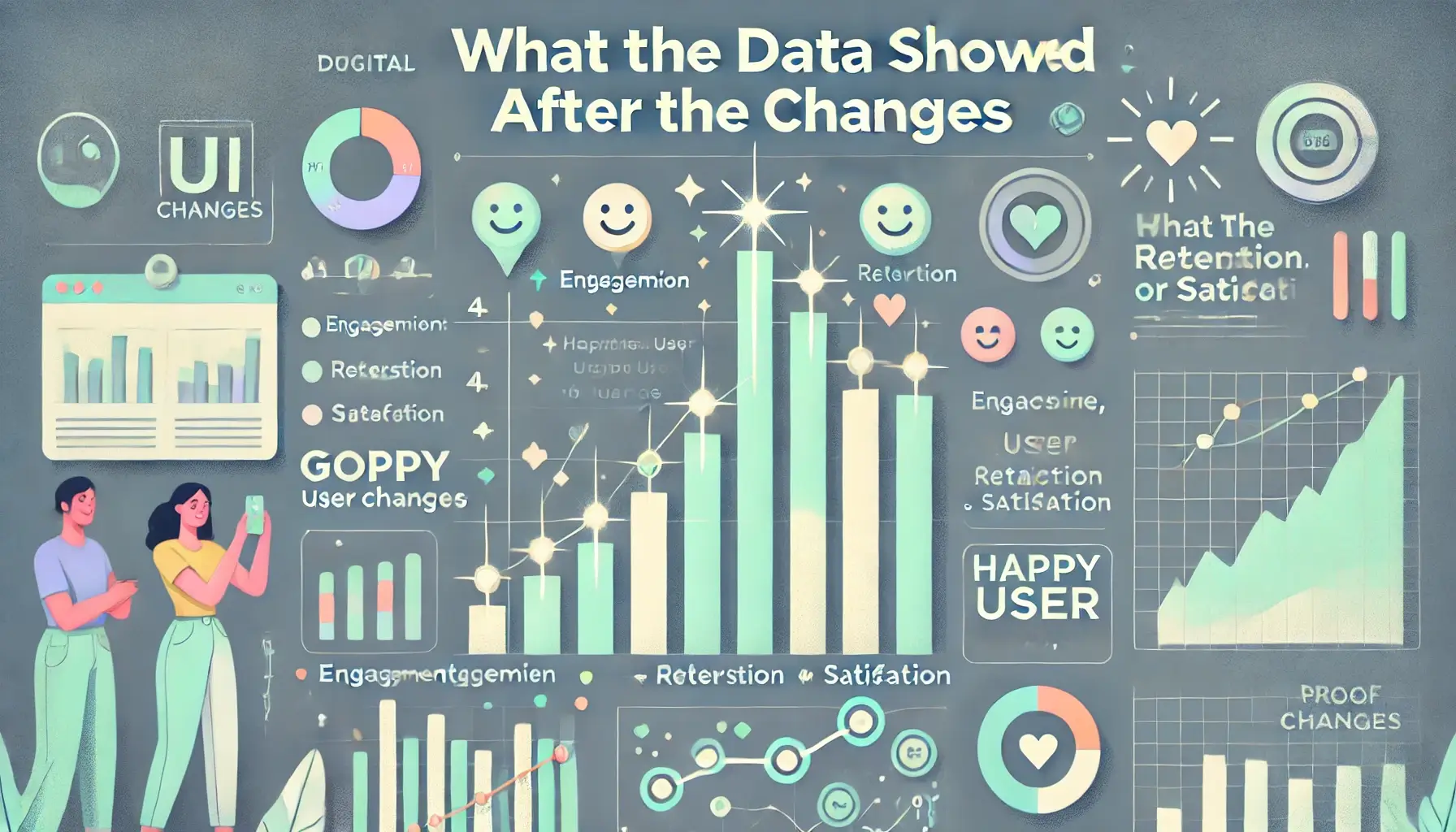
We weren’t guessing when we said uninstall rates dropped. We tracked everything from day one — app opens, tap paths, session length, and of course, uninstall events. After we rolled out the three UI updates, the numbers started changing almost immediately.
The biggest shift? Uninstalls dropped by 60% in the first two weeks.
That alone was huge. But there was more. Session time went up by 35%. People didn’t just stop uninstalling — they were sticking around longer. They tapped through more screens, explored features they hadn’t used before, and a few even left feedback saying the app “finally made sense.”
Another detail we saw? Support requests decreased. Things that confused users before — especially during onboarding — were no longer an issue. That freed up our client’s internal team from having to answer the same questions over and over again.
We also noticed a jump in conversion. More users completed the in-app goals (which in this case was profile setup and connecting with others). None of that had changed on the backend — it was all tied to better flow and simpler layout.
At DM WebSoft LLP, we believe real product decisions should always be backed by this kind of data. We build apps, yes — but we also help clients track what happens after launch. Through website maintenance and support, SEO optimization for websites, and smarter digital marketing strategies, we give product teams a better handle on what’s working — and what’s not.
Design isn’t just about how something looks. It’s how it performs. And when your app is clearer, cleaner, and easier to use, the data will prove it.

Why Simpler UI Leads to Higher Retention
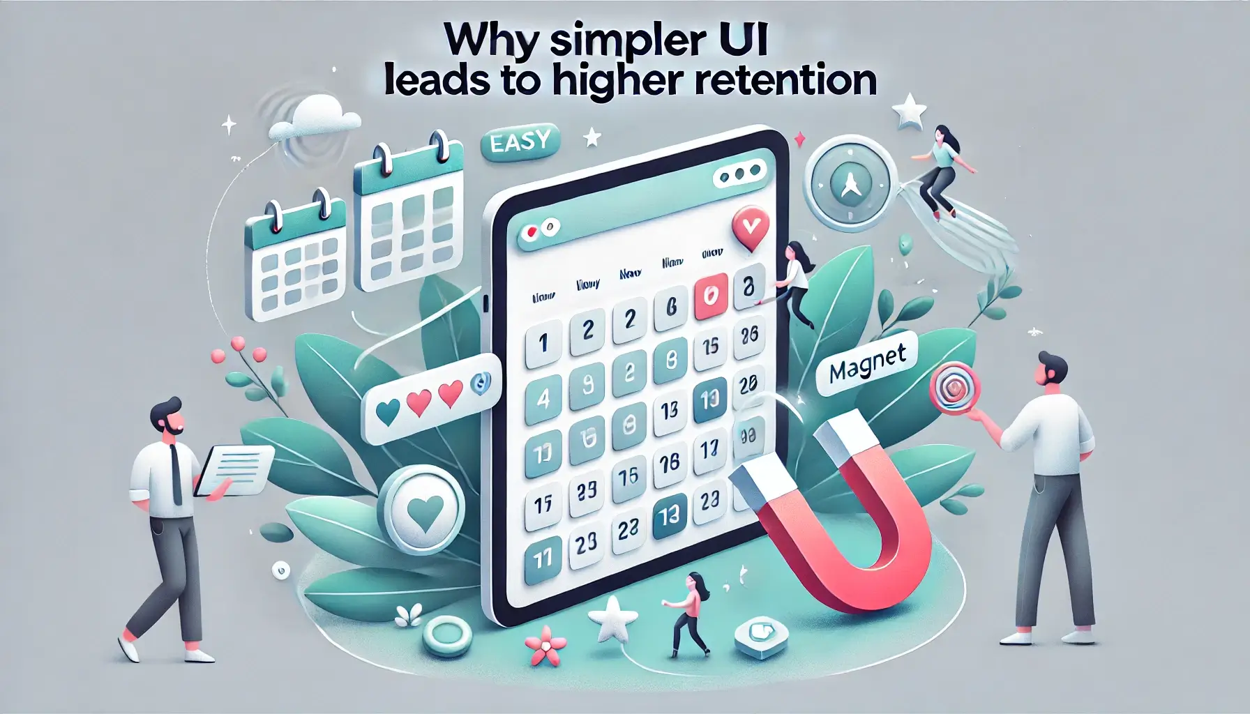
There’s a reason the phrase “don’t make me think” is such a common principle in user experience design — because it’s true. People don’t use apps to explore menus or figure things out. They open the app, expect it to make sense, and move on. If it doesn’t feel smooth within the first few seconds, they close it — and they don’t always come back.
That’s where UI design plays a bigger role than most teams realize. Simple doesn’t mean basic. It means frictionless. Clean layouts, clear buttons, obvious navigation — these things don’t impress on a demo call, but they matter to the person trying to use your app on a bus, in a rush, or one-handed on a phone screen.
In our case, once we removed the friction points, user behavior changed fast. The experience became effortless. People found what they were looking for without guessing. That’s what keeps them around.
At DM WebSoft LLP, we help our clients think this way from day one. Whether it’s a brand-new build or improving an existing app, our team brings practical experience in mobile app development, custom software solutions, and web development services. We don’t just make apps look good — we make sure they work well where it counts: in users’ hands.
Sometimes we also bring in AI in web development to test different flows, monitor how users behave in real time, and use that data to adjust layouts or features. But at the core, it always comes back to one thing: make the product easier to use, and people will use it longer.
That’s not theory. That’s what we’ve seen — in this project, and in dozens of others. Simple UI is more than clean design. It’s a strategy for keeping users engaged.
Why Better UX Doesn’t Mean Bigger Budgets

One of the biggest myths in app development is that better user experience means spending more. But in our experience, and with many of the projects we’ve worked on, it’s not about adding expensive features or hiring a massive design team. It’s about paying attention to the details that affect people right away.
We’ve seen teams spend thousands building features that users never even reach, simply because the entry point wasn’t clear. Or worse, the feature looked like a banner ad, so users ignored it. That’s not a design issue — that’s a communication issue. And those are the kinds of problems that can be fixed without breaking your timeline or your budget.
In this project, we didn’t suggest a rebuild. We didn’t overhaul the backend. Instead, we looked at where users were getting stuck and cleared the path. That’s it. We used existing assets, made layout changes, and improved the visual hierarchy. It didn’t take weeks — it took a few days. But the difference in retention and engagement? That was lasting.
At DM WebSoft LLP, this is something we talk about early with every client. Whether they’re starting with Laravel development services, WordPress website development, or planning a full e-commerce website development project, we help them make smart UX decisions before writing a line of code. That’s how you avoid wasted effort — and keep your app lean without making it feel cheap.
Improving UX isn’t about doing more. It’s about doing less, better. The more you reduce confusion, the less support you’ll need, the more conversions you’ll see, and the less likely users are to walk away after one session.
And that’s the kind of result you can build into your process — without inflating your costs.
What You Should Look at First in Your Own App
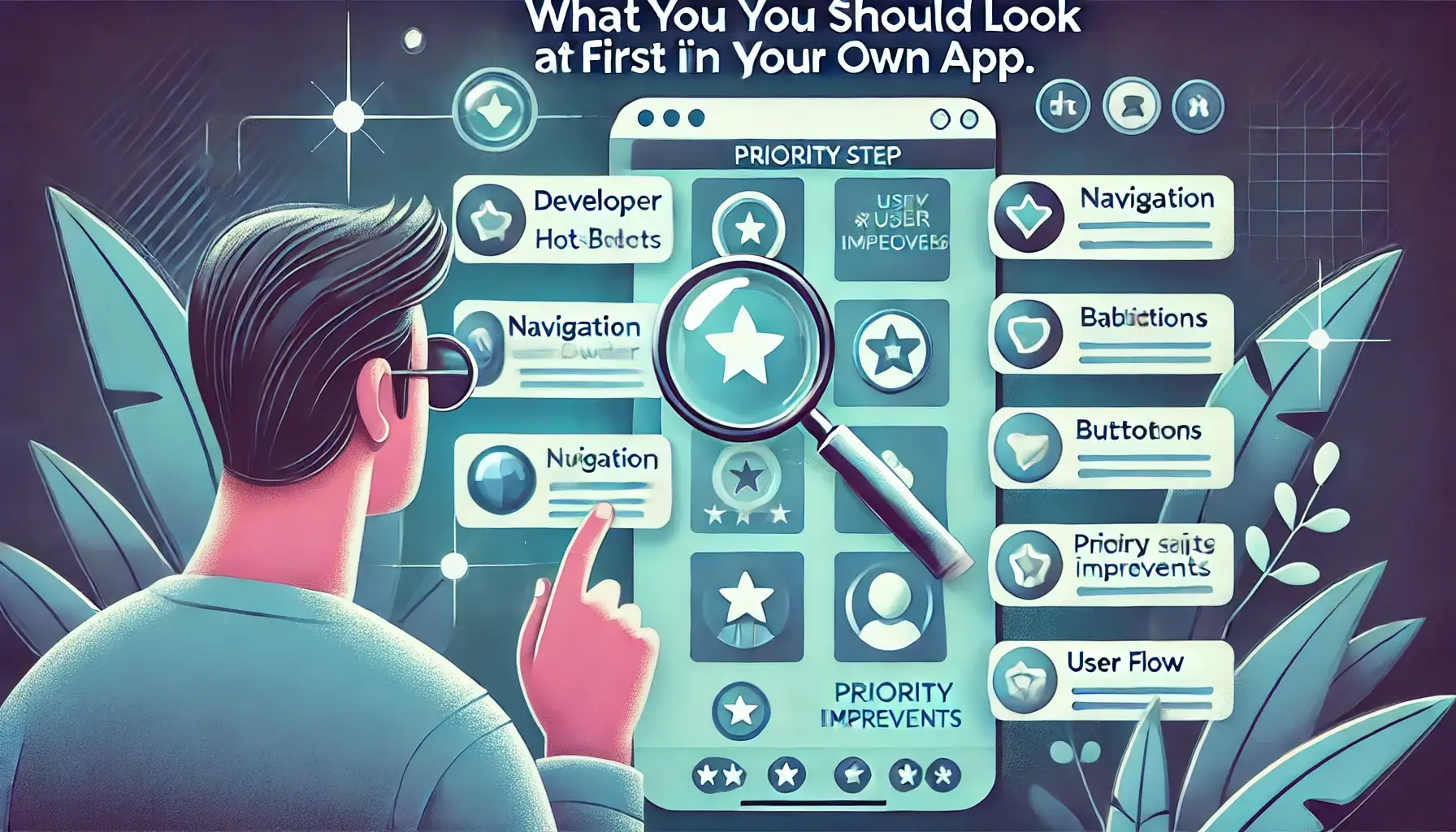
If your uninstall numbers are high, it’s easy to panic and assume you need to rebuild the whole thing. But in most cases, that’s not necessary. The problems are often closer to the surface than you think. You just need to know where to look.
Start with the user’s first 30 seconds. That’s when most people decide whether they’ll stick around or delete. Ask yourself: is the purpose of the app clear without explanation? Can someone new figure out what to do without instructions? If not, that’s where to begin.
Then check your primary action. Whatever you want users to do first — create an account, book a session, browse products — is that path obvious? Is it easy to reach? If you’re hiding your main goal behind too many taps or poor visual cues, you’re losing people before they even start.
We usually recommend doing a short usability test with just five people. Watch them try to complete your app’s main task. Don’t guide them. Just observe. You’ll learn more in one afternoon than a month of analytics will tell you.
At DM WebSoft LLP, we build products, but we also help companies find these weak spots before they become expensive problems. From early-stage mobile app development to launching and maintaining professional web development projects, we look at the full picture. That includes website security solutions, digital marketing for small businesses, and of course, the little UI elements that make a big difference.
You don’t need to do everything at once. But you do need to get the core experience right. That’s what keeps people from uninstalling — not more features, not bigger budgets. Just a better first impression.
How to Keep Improving After You Fix the Basics
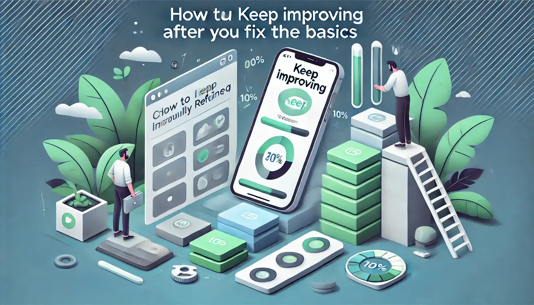
Once you’ve solved the major issues in your app’s UI, it’s tempting to call it done. But the reality? That’s just your starting line.
Apps aren’t something you finish. They change — because your users change. Devices update, habits shift, and what worked well six months ago might suddenly feel a little off. If you’re not paying attention, even a solid product can start to slip.
After we made those three interface fixes and saw uninstall rates drop, we didn’t stop there. We kept watching how people used the app. Nothing too complex — just regular check-ins. Heatmaps, basic feedback, and a few real-user recordings. That alone helped us catch a new issue a few weeks later: users were lingering longer, but not completing setup. One small design change (that we introduced later) had quietly caused new confusion.
Because we had eyes on it, we fixed it quickly. No rebuild, no long meetings. Just a minor adjustment.
This is the rhythm we follow at DM WebSoft LLP. Whether we’re offering web development services, maintaining WordPress website development, or rolling out updates on apps built with Laravel, we guide clients in keeping things simple and clear — even as they grow.
It’s not just about code. It’s about keeping your product healthy, usable, and responsive to the people who matter most — the users.
You don’t need a huge team or massive redesigns every quarter. But you do need to listen. Most of the best improvements? They come from watching quietly, then acting quickly.
Why Your Development Partner Matters More Than You Think

Most people don’t think about the team behind an app after it launches. But honestly, that’s often where the real difference is made — not in what you build, but how you keep it alive.
We’ve seen this a lot. A company gets their product out the door, but a month later, uninstall rates start climbing, bugs pop up, users drop off. And the team’s stuck trying to figure out what happened. Nine times out of ten? It’s not that the app was built wrong. It’s that nobody stayed around to help it grow.
That’s where your development partner matters.
At DM WebSoft LLP, we stick with our clients well after version one. We help keep things working, yes — but more than that, we help teams spot what’s changing. That might be something small, like a layout shift confusing mobile users. Or something deeper, like needing better website security solutions or even a shift in digital marketing strategy. Sometimes we bring in our SEO optimization team to help improve visibility; other times, it’s as simple as adjusting how the app loads.
We also work across tools that scale — Laravel, PHP, custom builds — and offer long-term website maintenance and support. But at the core of it all, what we really do is help teams keep listening to their users.
Apps don’t succeed because they’re perfect. They succeed because someone pays attention.
If you want a product people stick with, you need a team that doesn’t disappear after launch. That’s where the real work starts — and that’s where we stay involved.
Improvement Isn’t a One-Time Job
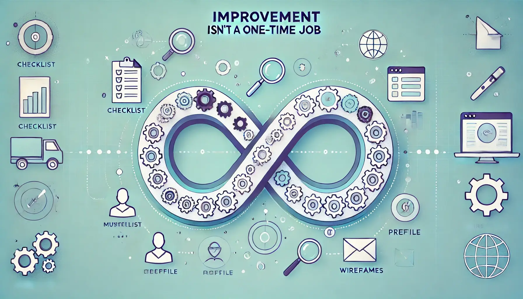
You launch an app. Everything works. People download it. Then, slowly, things start to slip. Fewer signups. Shorter sessions. Maybe even bad reviews. You patch one thing, fix another. But the bigger problem? It’s not about any single bug. It’s that you’re reacting instead of improving as you go.
That’s what most teams miss.
The thing we’ve learned — through a lot of projects — is that app improvement isn’t a project. It’s a habit. The teams that win long term aren’t the ones chasing fixes. They’re the ones quietly watching how people use their product, and making small, smart updates before anything breaks.
We saw it firsthand. After those three UI changes, results improved. Uninstalls dropped. But we didn’t treat that as “done.” We kept tracking. When another small friction point popped up weeks later, it was obvious — and easy to fix.
That’s the rhythm we follow at DM WebSoft LLP. Whether we’re handling custom software solutions, full mobile app development, or even WordPress website development, we stay involved. We track, adjust, and help teams think in terms of long-term usage — not short-term launches.
We also offer web development services built with maintenance in mind. Not every product needs big changes. Sometimes it just needs someone who’s paying attention.
You don’t need a huge team. You just need the right one. The kind that sticks around, asks questions, and sees what others miss. That’s where growth comes from — not in rebuilding everything, but in getting better one small decision at a time.
Why Long-Term Success Starts With the First Impression
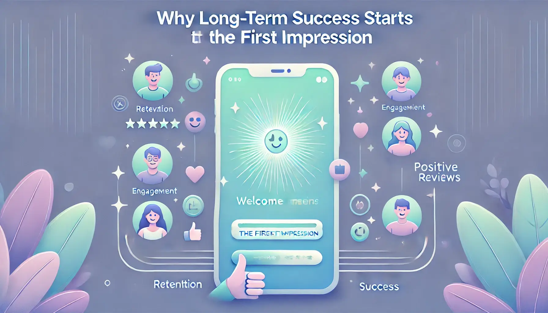
A lot of people think success in the app world is about big launches, big features, or the next update. But we’ve seen the opposite more often than not. What really sets strong products apart is how they treat the first interaction.
Not the fifth feature. Not the fancy dashboard. Just that moment when someone opens the app and asks themselves, “Does this make sense?”
That’s where people stay — or leave.
In the project we’ve been talking about, all we changed were a few small UI elements. But the impact wasn’t small at all. People stuck around. They used more features. They told others about it. Not because the app did more, but because the start of the journey finally made sense.
At DM WebSoft LLP, that’s a conversation we have with almost every client. You can have the best mobile app development team, the strongest website security solutions, the most customized WordPress website development — but if your product feels confusing or clunky in the first minute, none of that matters.
That’s why we stay close after launch. We look at what’s actually happening. We help teams make small fixes before small problems become real ones. And whether we’re working on professional web development or helping with growth through digital marketing for small businesses, it always starts with that question: what’s it like to open this for the first time?
Sometimes, fixing that part is all it takes.
You don’t need perfection. You need clarity. And the sooner that starts, the better your results will be — not just at launch, but long after.
Conclusion: The Fix That Actually Worked
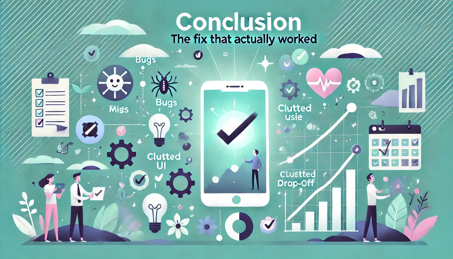
It’s easy to assume that solving big problems means making big changes. But sometimes, what really moves the needle isn’t a new feature or a full redesign. It’s clarity. Focus. Removing just enough friction so the user experience feels natural from the very first screen.
That’s what happened here. The product didn’t change. The code didn’t change. What changed was how it felt to use. And that made all the difference.
People stayed longer, used more features, and stopped leaving after one try. That wasn’t luck — it was the result of watching how people interacted with the app and being willing to question decisions that once felt solid.
At DM WebSoft LLP, this kind of thinking is baked into the way we build. Whether we’re starting a new mobile app development project, improving a custom software solution, or offering website maintenance and support for an existing product, we look for the things that quietly shape the user experience — especially the things no one notices until they go wrong.
We also help businesses see beyond the code. That means guiding smarter decisions around SEO optimization for websites, using tools that support flexibility like Laravel development services, or simply helping small teams build momentum with thoughtful digital marketing strategies.
We’ve worked with startups, e-commerce brands, service companies — and the pattern is always the same. The strongest results don’t come from building more. They come from getting the basics right, early on, and staying committed to improving over time.
This wasn’t a redesign story. It was a clarity story.
And if your app’s not performing like it should, that might be where you need to look next — not at what’s missing, but at what’s unclear.
What caused users to uninstall the app?
Confusing UI and poor onboarding flow were the main reasons users dropped off early.
How did DM WebSoft LLP help reduce uninstall rates?
By identifying key friction points and applying focused UI improvements, we helped improve retention by 60%.
Were major changes or features added to the app?
No — the solution involved simple design tweaks, not complex feature additions.
What services does DM WebSoft LLP offer to improve app retention?
We offer mobile app development, custom software solutions, and post-launch user experience support.
Can DM WebSoft LLP assist after app launch?
Yes, we provide ongoing website maintenance, UI refinement, and data-driven improvements for long-term success.
Get Started Now !
What’s the Process ?

Request a Call
Consultation Meeting
Crafting a Tailored Proposal
Get Started Now !
Real Stories, Real Results. Discover What Our Clients Say

CEO, T******** Enterprises
Working with DM WebSoft LLP was a game-changer for our business. Their technical prowess and innovative solutions transformed our online presence. A highly recommended web development agency with a stellar track record.

VP of Marketing, M****** Innovations
We are thrilled with the results DM WebSoft LLP delivered. Their deep understanding of web development coupled with years of expertise ensured a seamless and visually stunning website. True professionals!

CTO, H******* Tech Solutions
In a digital age where first impressions matter, DM WebSoft LLP crafted a website that speaks volumes. The team’s attention to detail and commitment to quality set them apart. Thank you for making our vision a reality.

Director of Operations, C******** Enterprises
DM WebSoft LLP’s team demonstrated unparalleled expertise. Their ability to navigate complex technical challenges with ease is truly commendable. Choosing them for our web development needs was the best decision.

Founder, F***** Digital Ventures
Exceptional service, unmatched skills! DM WebSoft LLP stands out as a leading web development agency. Their collaborative approach and commitment to excellence make them our go-to partner for all things web-related.

Chief Marketing Officer, T***** Tech Solutions
DM WebSoft LLP turned our ideas into a digital masterpiece. The seamless communication and timely delivery of our project showcased their professionalism. Highly impressed with the level of creativity and skill.

Head of IT, J******* Innovations
Our experience with DM WebSoft LLP was nothing short of amazing. From concept to execution, their team provided top-notch web development services. A reliable partner for businesses looking to elevate their online presence.

Director of Creative Services, W****** Studios
DM WebSoft LLP’s team of tech experts is second to none. Their wealth of experience reflects in the quality of their work. Our website not only meets but exceeds industry standards, thanks to their dedication.

Chief Technology Officer, A****** Enterprises
Choosing DM WebSoft LLP was the best investment for our web development needs. Their team’s proficiency, coupled with a customer-centric approach, made the entire process smooth and enjoyable. A pleasure to work with!

VP of Digital Strategy, C****** Solutions