DM WebSoft LLP exceeded our expectations! Their seasoned team of experts delivered a website that perfectly captures our brand essence. Their 15+ years of experience truly shine through in their exceptional web development skills.
Building Responsive Web Applications with CSS Grid and Flexbox

TABLE OF CONTENT
Introduction: The Importance of Responsive Web Design
Why Responsive Design is Essential for Modern Web Applications
Understanding CSS Grid and Flexbox in Web Development
Best Practices for Combining CSS Grid and Flexbox in Responsive Design
Common Pitfalls to Avoid with CSS Grid and Flexbox
How DM WebSoft LLP Delivers Cutting-Edge Responsive Web Solutions
Future of Responsive Web Design with CSS Grid and Flexbox
Conclusion: Embracing Responsive Design for a Competitive Edge
Get in Touch
Introduction: The Importance of Responsive Web Design

Today’s digital space has people reaching your website from every gadget possible: smartphones, tablets, laptops, and even desktop computers. Where the habits change, so do the expectations, given that users want seamless online experiences and no difference between devices. That’s where responsive web design stepped in, enabling sites to adapt dynamically and give consistent experiences, whatever the device. It has become, in fact, not an option, but a commitment, an obliged duty for each firm that shall require responsiveness in their web application.
That is where technologies such as CSS Grid and Flexbox have been real game-changers. These tools let developers create adaptable, visually stunning layouts that make absolutely no sacrifices in terms of usability or performance. Taken together, CSS Grid and Flexbox offer a flexible foundation for web applications that look and perform great on every device. From development in e-commerce websites to developing great mobile applications, these tools are changing the way we think about and design for the web.
DM WebSoft LLP forms the perfect edge for businesses seeking reliable and advanced web development services. It gives much priority and emphasis on developing mobile-friendly web design, showing how to implement custom software solution mechanisms that bridge the gap with every project to meet user and business needs. With our expert skills specialized in responsive design techniques and SEO optimization, we help our clients build lasting connections with their audience. DM WebSoft is a professional web development company that provides a wide range of services, starting from SEO optimization of websites to website maintenance and support, including AI in web development, with the view to keep your digital presence dynamic and secure.
In this blog, we explore how CSS Grid and Flexbox are used to create responsive layouts that captivate users. We will actually be covering real case studies, best practices, and some tips on how to combine these two powerful tools in the quest to create responsive applications that will surely stand tall among competitors in today’s market. Whether your business is established or a startup, understanding responsive design’s role in modern web development could make all the difference in user engagement and SEO ranking.
Why Responsive Design is Essential for Modern Web Applications
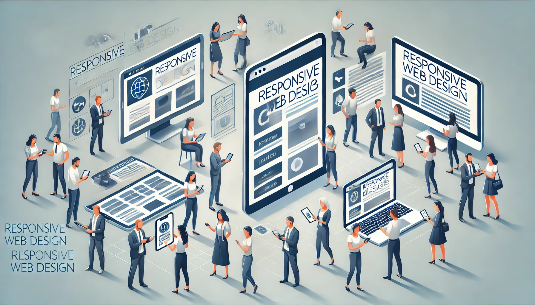
A website in today’s digital space serves a purpose far grander than just ‘being there’ online; usually, it creates the first impression for the existence of a brand. In today’s world, users are on smartphones, tablets, laptops, and desktops. They want to have a seamless and consistent experience across every device. That demand has turned responsive web design into practice. Responsive design automatically resizes your website according to any particular size or resolution of a computer screen, and this becomes highly desirable in industry sectors where user experience might determine your conversion rate, such as in e-commerce or while developing mobile apps.
Responsive design isn’t a trend anymore; it’s a crucial investment in today’s mobile-dominated world. According to research conducted by Google, more than 50% of internet traffic comes from mobile devices, a number which keeps growing consistently.
This makes responsive design an indispensable part of web development in bringing a better user experience and ensuring enhanced search engine rankings. Search engines like Google improve the results of websites that perform best on mobile devices; hence, making responsive design one of the basic elements of SEO.
The Business Case for Responsive Design Responsive design has quite a number of benefits for businesses across different segments. In e-commerce, responsive design enhances engagement and conversion a lot because customers would view and shop from any device easily. Beyond this, responsive design provides a consistent, professional brand experience that can engender trust and credibility in companies relying on software solutions or even digital marketing campaigns. At the forefront of web development services is DM WebSoft LLP, which develops responsive web applications designed to meet specific business requirements. Being a professional web development company, DM WebSoft guarantees the use of state-of-the-art technologies in developing adaptive layouts, including CSS Grid and Flexbox, to increase usability and performance. This forms an ideal foundation for mobile-friendly web designs, backed by our proficiency in AI and web development, which enable our clients to reach their objectives and be relevant in an ever-changing digital world.
Why SEO-Friendly Responsive Design Matters: Responsive design plays a central role in the digital marketing of both small businesses and larger enterprises due to its effectiveness in enhancing search engine visibility and driving organic traffic.
Moreover, a responsive website is ranked better by search engines, but it also contributes to the user experience: it reduces bounces and increases time on site. These two elements combined turn this into a powerful factor for SEO, as search engines get the signal that users find the site very valuable. With a responsive site, there will no more be the need for two separate URLs for desktop and mobile; thus, all users can go to one single optimised URL, thereby promoting SEO optimization. To businesses that strategize for their next web development project, be it WordPress website development, Laravel development work, or custom integrations, DM WebSoft LLP seamlessly integrates technical expertise and user-oriented design. We develop responsive, mobile-friendly web applications for outstanding results across platforms, enabling your business to reach a wider audience and reinforcing its digital presence.
Understanding CSS Grid and Flexbox in Web Development

Responsive design that should look and work great on each device type—from tiny smartphones and tablets to big screens—requires flexibility in the layout system. This is where CSS Grid and Flexbox come into play. Equally powerful layout tools, each has different strengths in helping developers create adaptable designs for responsive web development. By utilizing the powers of CSS Grid and Flexbox, developers are able to provide responsive web applications that give a better user experience and more aesthetic appeal—these being two major factors directly influencing SEO optimization of websites.
CSS Grid – The Foundation of Content Layouts
CSS Grid is one such method that uses a two-dimensional grid of rows and columns to arrange elements. It’s particularly helpful for constructing complex, structured layouts that are supposed to hold consistent on a range of screen sizes. Different from other layout methods, which rely on floats and positioning, CSS Grid allows a more intuitive way of designing the layout; the adaptability of visually engaging interfaces can be much simpler to realize. For example, CSS Grid can be used to give developers a more cohesive structure in regard to product listings during an e-commerce website development project so they would look great both on desktop and mobile.
At DM WebSoft LLP, we merge CSS Grid into our web development services to develop all sorts of structured and flexible layouts for clients of any sector. Be it WordPress website development or custom Laravel development services; our team uses CSS Grid to extend responsive layouts following a user-driven engagement and adaptability-centric approach. Flexibility guarantees that the business gets reliable solutions related to mobile-friendly web design and website security.
Flexbox: The Power of Flexibility in Responsive Design
While CSS Grid is ideal for large, structural layouts, Flexbox has become the standard for smaller components and creating flexible, one-dimensional layouts. With Flexbox, developers can set up items along a single row or column and manipulate the spacing and alignment of elements to flow into any size screen. Consequently, it is also very helpful in developing adaptive components like navigation menus, buttons, and other individual content blocks that should change on mobile devices.
With Flexbox, developers can extend the responsiveness of key design elements and ensure consistency in user experiences irrespective of the device being used. This flexibility is important in building mobile-friendly web designs and digital marketing strategies since it allows retention and brings improvement toward SEO rankings. At DM WebSoft LLP, we use Flexbox in our custom software solutions to provide responsive components for clients that help elevate functionality and aesthetics.
CSS Grid vs. Flexbox: When to Use Each for Optimal Results
Both CSS Grid and Flexbox play a crucial role in responsive web application development; however, both solve different problems. Following is a quick comparison that might help you decide when to use which:
- CSS Grid is perfect for designing the main structure of a page, such as rows and columns that outline the overall shape of a layout.
- Flexbox is good for features in random parts of the code, such as a grid for small areas: navigation menus, image galleries, or buttons.
By integrating CSS Grid and Flexbox, one can create responsive layouts that are both functional and visually stunning, developing adaptive web applications to suit each client’s particular needs. Here at DM WebSoft LLP, professional web development covers all the latest design trends to ensure that websites are user-friendly, look great, and conform to SEO standards.
Best Practices for Combining CSS Grid and Flexbox in Responsive Design
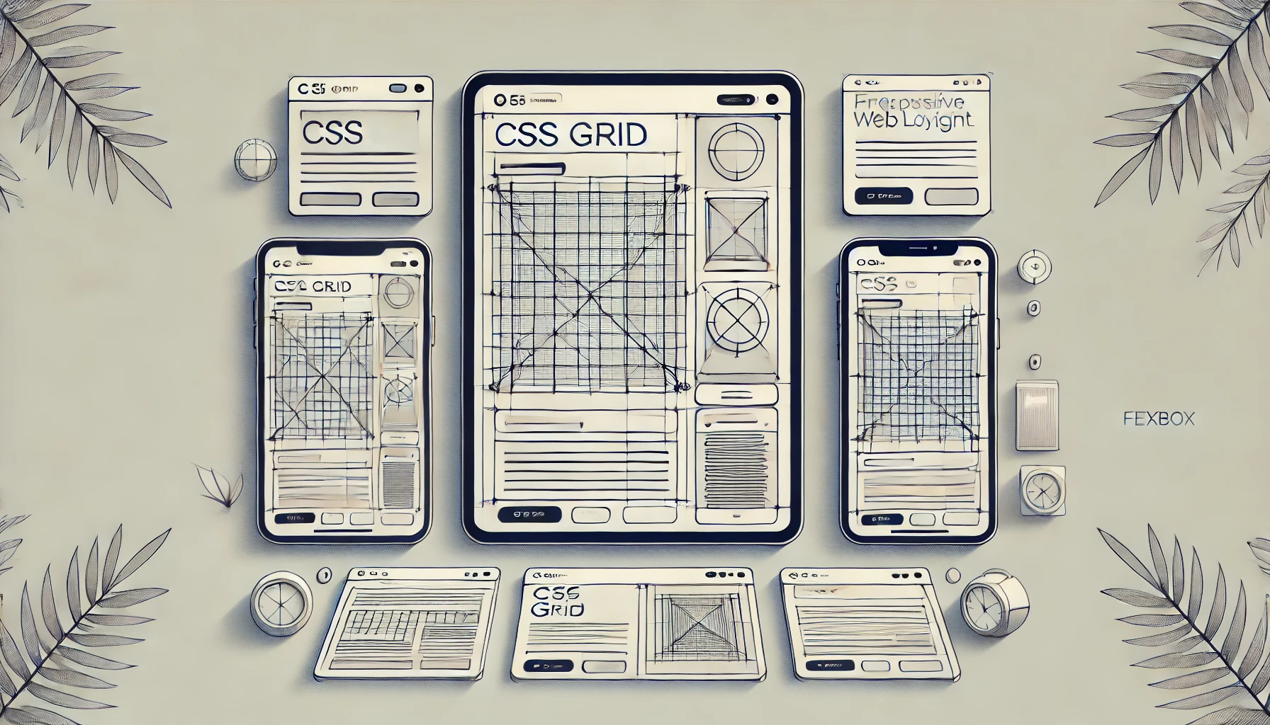
Wrapping up a fully responsive web application demands a delicate balance between flexibility and structure, where combining CSS Grid and Flexbox can turn out very powerful. CSS Grid provides the overall structure in laying out the primary page areas, where Flexbox adds adaptability within those grid areas. Used together, these tools will create web layouts that are at once visually cohesive and functionally flexible—an important ingredient in optimum mobile-friendly web design. Below are some of the best practices in which CSS Grid and Flexbox have been combined to construct responsive layouts—from desktops down through smartphones.
Use CSS Grid for Page Layout, Flexbox for Content Flexibility
One of the most popular ways of using both CSS Grid and Flexbox together is to use Grid to define the main structure of the webpage, while Flexbox would arrange the individual content blocks within those. Easily in such situations, CSS Grid could take over main page sections like headers, footers, and sidebars. Flexbox is good for maintaining content within those sections, which may include navigation links, buttons, or small galleries that need to wrap depending on screen width. In addition, this makes it perfect for developing e-commerce websites where product listings and navigation menus, along with UI elements, must align perfectly across devices. At DM WebSoft LLP, our team makes use of CSS Grid and Flexbox to deliver structured, user-centered designs that meet the very specific needs of our clients. As a professional company needed for web development services, each of our layouts should be responsive, intuitive, and geared towards the best user experience.
Start with a Mobile-First Approach to SEO Optimization
At the time of making any web responsive application, the design is the most prior one that needs to be taken care of with a mobile-first approach and then develops it for larger screens. This mobile-first approach ensures that the site will perform excellently on small screens and also supports SEO optimization of websites. Google gives much preference to mobile-friendly sites in its search results, so starting off with a mobile layout, then adding enhancements for larger screens, will help your visibility. To create a ‘mobile-first’ design using CSS Grid and Flexbox, you would set up a simple, flexible Flexbox container for mobile, then create a full CSS Grid layout for desktop or tablet views. Thus, it allows transition from one device to another to be smooth and seamless, and will definitely help chop down the loading times and improve the performance—two of the main components of good SEO strategy.
Simplify Designs to Load Faster and Perform Better
Responsive design isn’t all about look and feel; it’s about performance, too. Overly complicated layouts result in very long loading times—particularly on mobile devices. By laying emphasis on simplicity with CSS Grid and Flexbox, developers can avoid unnecessary codes, use better-optimized images, and offer seamless user experiences. This is a necessity with digital marketing strategies dependent on website speeds for SEO rankings down to conversion rates. One of the major concerns in web maintenance or support services that we offer here at DM WebSoft LLP is performance.Our team will make sure that every responsive design is a stunning view, but at the same time optimized for speed and efficiency. We use CSS Grid and Flexbox—strategically picked from among the best toolsets of web development—to empower our clients to achieve high-performing, mobile-friendly websites where users stay longer with better SEO.
Test Across Devices and Browsers
Finally, one of the most critical steps in responsive web design involves cross-device and browser testing. Even the most well-structured layouts can look quite different across various devices and browsers. The early and frequent testing by developers will help ferret out any compatibility issues and allow them to assure that things work the same. This is of special relevance for businesses which require customized software solutions, where each layout must be performing with consistency across user environments. DM WebSoft LLP goes further in development by offering comprehensive website maintenance and support to clients, thus keeping their websites responsive and compatible with browsers and devices that keep on emerging. This will, in the long run, help businesses stay connected online to promote their business without losing any potential customers due to problems with the layout.
Common Pitfalls to Avoid with CSS Grid and Flexbox

Though CSS Grid and Flexbox are both powerful tools in developing responsive web applications, they naturally present some common missteps. In these layout systems, a great deal of flexibility means potential for complexity, performance issues, and compatibility challenges. Understanding these pitfalls means developers can take full advantage of CSS Grid and Flexbox to develop seamless mobile-friendly web designs that enhance user experience.
Don’t Overengineer Layouts
One of the most common mistakes developers make with CSS Grid is overengineering layouts. Too much grid nesting or over-documentation of structures will lead to messy code and a fragmented user experience. Difficult layouts also raise the load times—a thing that can turn out disastrous in its consequences for SEO optimization on mobile devices. It’s always good to keep a clean and efficient layout, using CSS Grid for high-level structure and trying not to overnest elements. Simplicity and usability are just two of the important focal points for our agile web development team here at DM WebSoft LLP. We keep a clean, maintainable grid structure that guarantees fast loading with an optimized user experience. In our Web Maintenance and Support Services, we support customers in refining layouts so that complex grids have a minimal effect on their SEO and customer satisfaction.
Not Testing for Cross-Browser Compatibility
As much as there is wide support, not all browsers are created equal, and some handle these tools differently. What might look great in one browser could be off-kilter in another if cross-browser testing isn’t performed. To avoid this, one should check the layout across all major browsers and gadgets to ensure consistency in user experience. DM WebSoft LLP considers cross-browser compatibility a serious factor. Part of our Website Maintenance and Support Service includes checking the designs across different platforms and unique devices for compatibility issues. In this exhaustive manner, it ensures that our client’s sites function top-notch, whatever browser choice their users decide to settle upon.
Accessibility After the Fact
Accessibility in Responsive Design plays a great role but usually falls after the fact. Too often, elements positioned by CSS Grid or Flexbox are not available to screen readers or keyboard users-navigation.Complex layouts make it more difficult for assistive technologies to understand the structure of a webpage and thus affect users dependent on such tools. Instead, more attention should be paid to best practices regarding layout and structure: semantic HTML and testing with screen readers promise to avoid problems of inaccessibility. DM WebSoft LLP follows Section 508 guidelines, from each of the projects with web development services, in order to reach audiences of all kinds. In a nutshell, accessible, inclusive design means all users will have a good experience on our clients’ websites.
Making Layout Decisions without Considering the SEO Impact
Responsive design is closely related to SEO optimization of websites. However, if not treated correctly, some layout decisions can make a dent in SEO. A possible example could be loading heavy layouts or images within the mobile views, which influences the site speed—every SEO person’s nightmare and also a part of Google’s current formula for ranking. Similarly, the important content placed low in the visual hierarchy affects how search engines can perceive page relevance.
At DM WebSoft LLP, our team considers SEO implications in every aspect of mobile-friendly web design. Using CSS Grid and Flexbox, we strategically maintain fast, SEO-friendly layouts that improve our clients’ search engine rankings. Whether for custom software solutions, WordPress website development, or e-commerce website development, we ensure a balance between responsive design and search engine visibility.
How DM WebSoft LLP Delivers Cutting-Edge Responsive Web Solutions
Whenever it pertains to creating a digital presence that impresses, selecting the proper professional web development company is very crucial. A well-designed, responsive website attracts visitors, not just to visit and bounce off, but with the ability to create an engaging user experience, further enhancing both user experience and SEO rankings.We pride ourselves on the custom software solutions or mobile-friendly Web Designs created at DM WebSoft LLP to suit any need or requirement of customers.
Full-service Web Development Solution
From WordPress website development to Laravel development services and PHP development, a variety of web development services can be well trusted on-ground with DM WebSoft LLP. Our team is fluent in modern layout tools like CSS Grid and Flexbox, creating structured and responsive layouts that work seamlessly across devices. Be it e-commerce website development or an interactive corporate site, we merge best practices with innovative design to turn your functional and visually engaging web solution into reality.
Not specifically targeting development for looks, but our process entails SEO optimization of websites.We design every website to be responsive, which means it will look and function perfectly on any screen size. This, in a nutshell, brings us to the actual creation of a website for the clients—making it functional and strategically designed to drive the most traffic and conversions by implementing this AI into web development and taking a close view of digital marketing strategies.
Maintenance of the Website and Success in the Long Run
Of course, launching a responsive website is merely the beginning. At DM WebSoft LLP, we understand that ongoing website maintenance and support are crucial in keeping any given site optimized and secure. Our maintenance services include performance checks and updates, regular assessments to assure that each of our client websites stays at the forefront of web technology. Addressing those other potential challenges includes website security solutions and mobile compatibility to deliver a seamless experience to users on all devices.
Again, DM WebSoft LLP ensures that with its support services, your site adapts to changing user needs and technology trends for businesses needing digital marketing for small businesses or scalable e-commerce website development. A company can thus be assured that by partnering with DM WebSoft LLP, its website will be responsive and functionally optimized to enable success in the long run.
CTB : Give your online presence a fillip with DM WebSoft LLP
Responsive development today has turned out to be unavoidable in the competitive digital space. That is why, at DM WebSoft LLP, we try our best to enable the success of businesses by building responsive, user-centered web applications that drive results. Our expertise in web development services ensures SEO optimization and custom software solutions so that each client gets a solution for his or her unique goals. If you’re ready to take your digital presence to the next level, do not hesitate to contact us at DM WebSoft LLP for more information about how our professional web development company can help. Whether looking to improve an existing site or develop a new, fully responsive application, we want to be of assistance in helping your business reach its full online potential.
Future of Responsive Web Design with CSS Grid and Flexbox
While technology continues to evolve, the demand for highly adaptive and intuitive web design is steadily on the rise. CSS Grid and Flexbox have already managed to revolutionize the ways developers approach constructing websites; however, there’s still a lot to come from their potential. With more and new features added to these tools all the time, they’re likely to play an even bigger part in the future of responsive web applications. Innovations such as container queries and even more dynamic grid capabilities will enable layouts to respond not only to viewport size but also to individual elements. Such a change in course will afford developers a level of control unmatched to this day, allowing developers to implement subtler and flexible designs that adapt much better to the peculiar needs of content.
And with even more advanced Artificial Intelligence in web development, the complexity of using CSS Grid and Flexbox will continue to decrease with the use of automated tools and responsive frameworks.
For instance, AI-driven layout tools will be able to automate the creation of layouts, freeing developers to refine the details and perfect the user experience. As a responsible partner of DM WebSoft LLP, we try to be ahead in this race. We continuously adjust our web development services to the latest sets of tools and best practices to make sure our customers get innovative, scalable, and SEO-friendly solutions. Similarly, in the future, investment in future-proof web design that is mobile-friendly will, therefore, make more sense for businesses to adapt to changing user behaviors. Clients who opt for a professional web development company like DM WebSoft LLP can benefit from exclusive access to the most state-of-the-art responsive design solutions, developed to grow with their needs.
Conclusion: Embracing Responsive Design for a Competitive Edge
The secret to user engagement, search engine optimization, and competitiveness in today’s modern digital landscape is a responsive and adaptable website. By combining the powers of CSS Grid and Flexbox, developers are ready to create layouts for seamless adaptation on all types of devices and ensure an experience that can be enjoyed by each visitor with ease. Be it complex e-commerce website development, dynamic mobile apps, or corporate websites, a responsive design will work wonders to make sure that both user experience and performance are maximized.
At DM WebSoft LLP, we’re committed to helping your business excel online through responsive, user-centered design. Our team of experts deploys the most recent tools and technologies—from custom software solutions to mobile-friendly web design—to deliver results that’ll drive traffic and conversions. Whether it’s web development services or ongoing website maintenance and support, we make sure our client websites are optimized for success.
If you want to get your website on and running, fully responsive, DM WebSoft LLP is ready to help. We believe in quality and innovation, making us the best choice for businesses seeking growth and adaptation in this digital-first world.
Responsive web design is an approach that ensures websites adjust seamlessly to different screen sizes and devices, enhancing user experience.
CSS Grid and Flexbox provide powerful tools for creating adaptable, flexible layouts, essential for building responsive web applications.
CSS Grid is ideal for creating structured, two-dimensional layouts, while Flexbox is best for one-dimensional, flexible alignments within sections.
Responsive design improves SEO by ensuring sites perform well on mobile devices, which Google prioritizes in search rankings.
DM WebSoft LLP specializes in building responsive, user-centered applications using the latest design tools, ensuring optimized performance and engagement.
Get Started Now !
What’s the Process ?
Request a Call
Consultation Meeting
Crafting a Tailored Proposal
Get Started Now !
Real Stories, Real Results. Discover What Our Clients Say

Working with DM WebSoft LLP was a game-changer for our business. Their technical prowess and innovative solutions transformed our online presence. A highly recommended web development agency with a stellar track record.

We are thrilled with the results DM WebSoft LLP delivered. Their deep understanding of web development coupled with years of expertise ensured a seamless and visually stunning website. True professionals!

In a digital age where first impressions matter, DM WebSoft LLP crafted a website that speaks volumes. The team’s attention to detail and commitment to quality set them apart. Thank you for making our vision a reality.

DM WebSoft LLP’s team demonstrated unparalleled expertise. Their ability to navigate complex technical challenges with ease is truly commendable. Choosing them for our web development needs was the best decision.

Exceptional service, unmatched skills! DM WebSoft LLP stands out as a leading web development agency. Their collaborative approach and commitment to excellence make them our go-to partner for all things web-related.

DM WebSoft LLP turned our ideas into a digital masterpiece. The seamless communication and timely delivery of our project showcased their professionalism. Highly impressed with the level of creativity and skill.

Our experience with DM WebSoft LLP was nothing short of amazing. From concept to execution, their team provided top-notch web development services. A reliable partner for businesses looking to elevate their online presence.

DM WebSoft LLP’s team of tech experts is second to none. Their wealth of experience reflects in the quality of their work. Our website not only meets but exceeds industry standards, thanks to their dedication.

Choosing DM WebSoft LLP was the best investment for our web development needs. Their team’s proficiency, coupled with a customer-centric approach, made the entire process smooth and enjoyable. A pleasure to work with!


