


DM WebSoft LLP exceeded our expectations! Their seasoned team of experts delivered a website that perfectly captures our brand essence. Their 15+ years of experience truly shine through in their exceptional web development skills.


The Role of Color Theory in Web Design: Creating Visual Harmony
Expertise:

TABLE OF CONTENT
Introduction: Color Theory and Its Importance in Web Design
Definition and History of Color Theory
Colors in Web Design and Their Psychological Effects
How Color Psychology Can Be Applied to Enhance Web Design
Infusing Color Theory in Web Design
How to Choose the Perfect Color Scheme for Your Website
Conclusion: Using Color Theory in Web Design
Get in Touch
Introduction: Color Theory and Its Importance in Web Design
Color is such a powerful attribute. It goes beyond aesthetics and forms an integral part of the world of web design, where color theory plays a significant part in visually effective and appealing experiences. But what exactly is color theory, and why does it matter in web design? Whether you are a designer building a website for a small business or a major corporation, it doesn’t make a difference; the concept of how to use color theory can be the difference between good and great design.
Color theory is what helps a designer develop an aesthetically pleasing color combination that actually sends the right message to the audience. For a web design color theory, one needs to go beyond selecting color palettes; it is actually more about strategically using color to affect the user experience, guide the viewer’s eye, or even draw attention. When done correctly, this can significantly boost user engagement with a website and brand recall, along with a lot more conversions.
But how can you apply color theory in a way that your audience truly gets? That’s where expertise takes shape. It’s companies like DM WebSoft LLP that indulge in creating web designs not just to look beautiful but to infuse the same principles of color theory into their designs. Partnering with experts ensures that your website doesn’t just look nice, but it actually works effectively to meet your business targets.
I’ve shared the basics of color theory with you, so now I can show you how to apply it to create visual harmony in web design. We will dive into the psychological effects of color and how to maintain a balance through it all, together with consideration of user experience and SEO. This guide will give you what you need to know in order to harness the power of color in your web design projects.
By the end of this article, you’re going to learn how to apply color theory to web design and make sites not only look beautiful but also work at their optimum. If you have a vision and want a companion in realizing it, DM WebSoft LLP is here to create captivating web designs that resonate with your business.

Definition and History of Color Theory
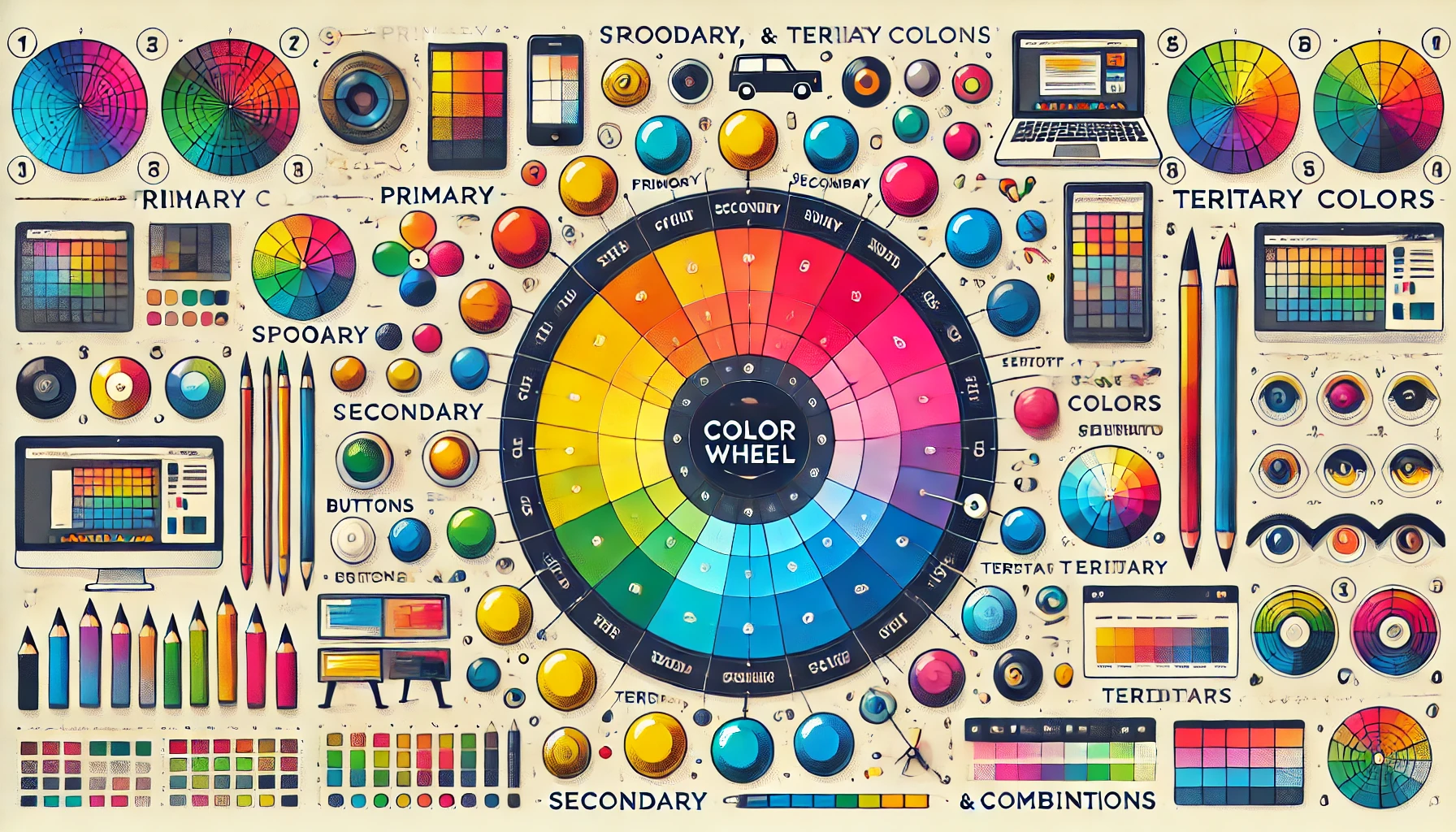
It provides pragmatic advice regarding color combinations as well as the visual outcome that emerges from the choice of color. It originates from the ancients, for instance, artists and scientists like Isaac Newton, who played with light in their experiments, discovering, among other things, the color spectrum. Following Newton’s discoveries, it was artists who invented the color wheel designed as a circular diagram, indicating the connections of the colors.
The wheel is the very basis of color theory, remaining one of the most important tools for designers up to today.
The color wheel has three primary colors, which are red, blue, and yellow. The secondary colors that resulted from it were green, orange, and purple. From there the tertiary colors come next, almost out of possible combinations red-orange, yellow-green and so forth. Knowing the relationships would enable one to produce a design with appropriately communicating the message.
Basic Elements of the Theory of Color
The most critical element of color theory in web design is an understanding of the way different colors interact with each other.
Here are some key elements to consider:
- Hue: The basic color itself, e.g., red, green, or blue.
- Saturation: The intensity of color, from dull to vivid.
- Value: The lightness or darkness of a color.
- Temperature: Colors are often defined as warm (reds, oranges, yellows) or cool (blues, greens, purples), which can evoke different emotions and responses.
These elements harmoniously put into place bring about a definite visual balance that more than anything is instrumental in improving user experience. For instance, it involves use of warm and cool colors to attract the eye to important areas of a webpage, correct usage of saturation and value can actually increase readability and make the content look more engaging.
Why Color Theory is Important in Web Design
Color theory in web design goes beyond mere guidelines for color selection; it is a strategic tool that impacts user behavior, brand perception, and even SEO performance. A well-thought-out color scheme can increase the chances of visiting a site and making customers out of them.
We at DM WebSoft LLP understand the power of color in website design. We design not only to be aesthetically appealing but also with an assurance that the website is designed using principles of color theory, assuring full optimization in terms of user engagement and conversions. We create designs focused on bringing color harmonies to each small element on a page to make sure that every part works together for a seamless user experience.
The following sections delve into the psychological impact of colors and how to design using color theory that really speaks to your audience.

Colors in Web Design and Their Psychological Effects
Color carries important information for human emotions and behavior, which is why color psychology is important in web design. Knowing exactly how colors influence perception, a web designer can match the experience to users in order to drive engagements and repeat views that also reinforce brand identity. In this chapter, we overview the psychological effects of various colors and how they can be practically applied for building a web design strategy.
Theory of Color: How Colors Influence and Affect Emotions and Behavior
Every color awakens a certain emotional response, one that might differ from cultural contexts to individual experiences. But generally recognized are certain common associations:
- Red: Often considered an arousing color, in terms of energy, passion, or even a sense of urgency, it can very well draw attention and provoke strong emotions. It is widely used in call-to-action buttons and highlighting information.
- Blue: Blue usually expresses confidence, calmness, and professionalism. It is the most common color for corporate websites and financial institutions as it tends to present the feeling of security and reliability.
- Green: Green is usually symbolized as growth, nature, and tranquility. That is why it is often used in brands that want to give out a message of eco-friendliness or health-consciousness.
- Yellow: Yellow stands for joy, optimism, and warmth. In representing such a feeling of welcoming warmth, the color yellow is extremely valid. Just use it in small quantities, though, because it can cause a great deal of visual fatigue if excessively applied in an environment.
- Orange: Orange reflects a feeling of being enthusiastic, creative, and excited. It is a very apt color for brands that wish to look both fun and highly adventurous.
- Purple: Purple indicates luxury, creativity, and sophistication. This color is good for brands that want to attract attention, indicating premium or differentiation.
- Black: Black is powerful, chic, and classic. It can evoke sophistication and command, but the dark tone should be tempered with lighter colors so it isn’t too heavy or overwhelmingly dramatic.
- White: White is for purity, simplicity, and cleanliness. Its uses can be seen in being a minimalist design and background to make other colors stand out.
How Color Psychology Can Be Applied to Enhance Web Design
Such psychological associations can allow web designers to apply color with more informed decisions. For example, if the intended effect of a website were to create feelings of trust and professionalism, then shades of blue would be added. A site designed for young creative professionals should be full of exuberance, energetic yet professional and can contain bright colors such as oranges or purples. Color theory is just as important in directing a viewer’s eye within a web page.
For instance, the CTA button should be in a contrasting color to pop out from the rest of the page, thus making it easy for users to take the intended action. Similarly, consistent use of the brand’s primary color across the website enforces brand identity and engenders a sense of familiarity and trust. We, at DM WebSoft LLP, are experts in color psychology and web design, creating great-looking websites capable of attracting and delighting the intended target customers. Hence, we conceptualize our sites to bring out the brand message and effectively provoke user interaction by understanding the emotions and behaviors inspired by different colors.
Real World Color Psychology Application in Web Design
In class, we’ve talked about the theories around color psychology, but this is where the rubber hits the road: how these theories are actually put into practice with a web design project. Perhaps a wellness brand uses calming greens and soft whites to establish an overall sense of serenity on their website. Or think of an online store for sportswear equipment that uses bold reds and blacks to signal power and energy. It, therefore, helps brands use strategic color to communicate at an emotional level, hence creating meaningfully better interaction and conversion.
Infusing Color Theory in Web Design
The general knowledge of color theory and psychological effects on people being seen, now let’s plunge into practical application of the two in web design. Learning how to utilize color theory effectively changes any ordinary website into a visually harmonious, interesting experience that easily leads users on from one element to another, so reinforcing the brand effectively.
Making Visual Harmony in Web Design
Visual harmony in web design refers to balance and the aesthetic arrangement of colors presented on a website. When colors are selected and combined purposefully, they establish a unified look that easily enhances user experience and focuses attention on major call-to-action elements.
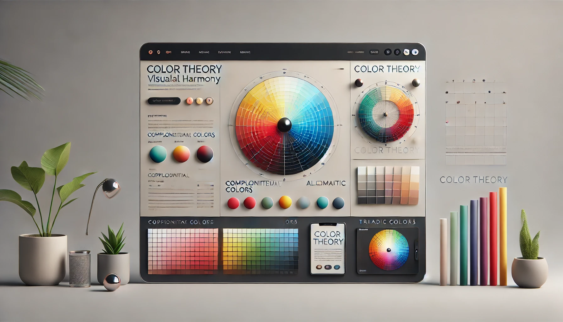
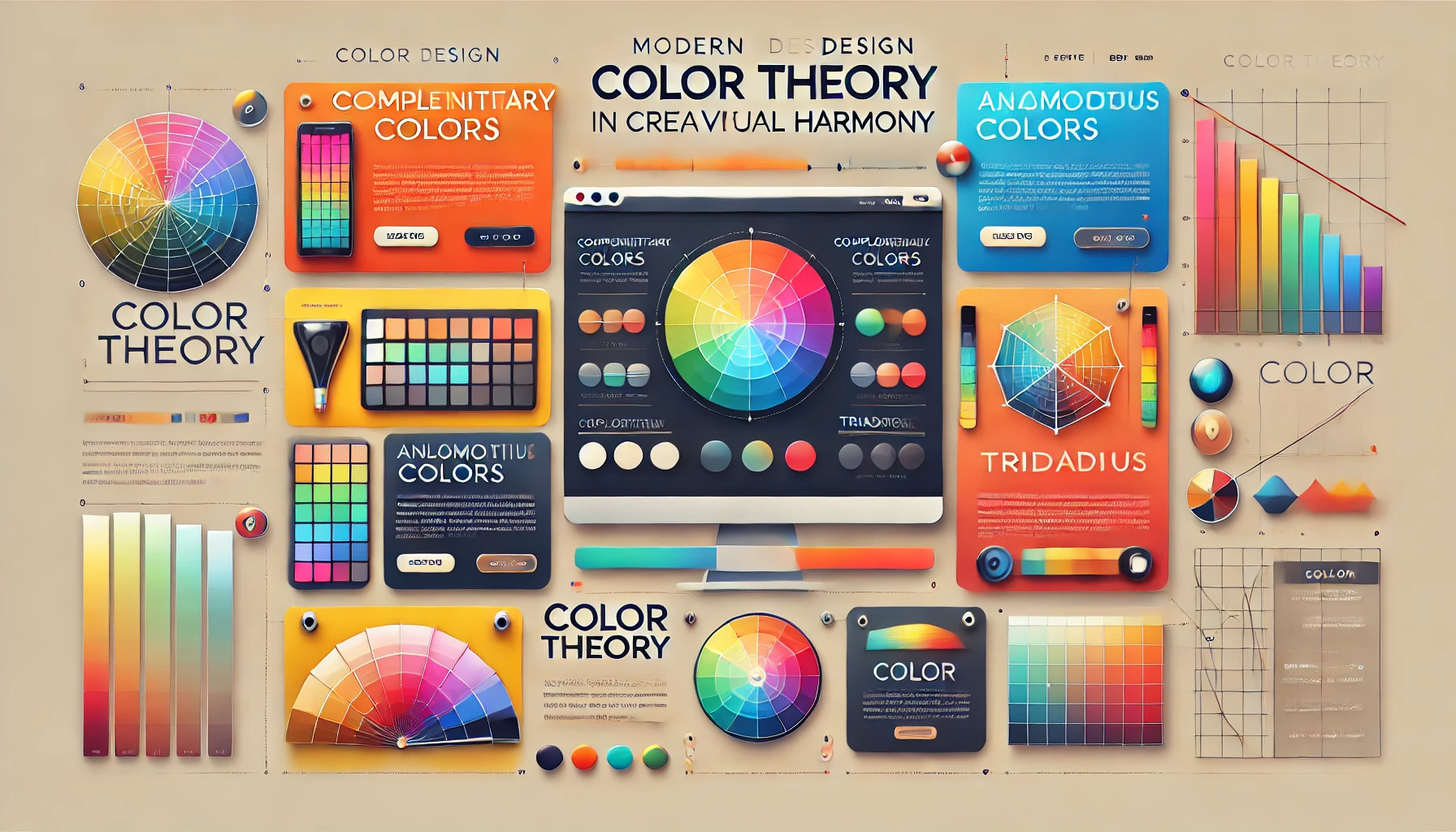
Often, these color combinations are used by designers on the color wheel to achieve visual harmony:
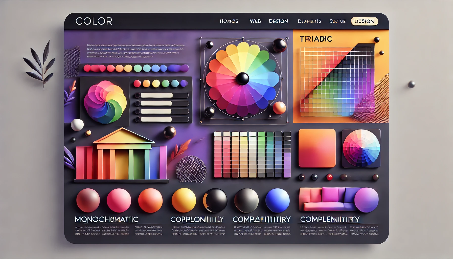
- Monochromatic color schemes: This is the use of tints, tones, and shades of one single color. Monochromatic schemes are subtle to produce a unified rich appearance but need careful contrast to generate interest rather than looking dull.
- Analogous Color Schemes: These are schemes made from colors next to each other on the color wheel. An example might be blue, blue-green, and green. They are quite pleasing to the eye and are well applied when designing for a calm, harmonious effect.
- Complementary color schemes: These involve pairing colors at the opposite sides of the color wheel, like red and green, or blue and orange. Schemes of this sort generally create high contrast and make elements really stand out—possibly very effective for call-to-action buttons or key content areas.
- Triadic and Tetradic Color Schemes: While triadic schemes use three evenly spaced colors on the color wheel, tetradic schemes work with four. These are more complex, offering a very dynamic, vibrant look but again need care in balancing to avoid overwhelming the user.
How to Choose the Perfect Color Scheme for Your Website
The selection of color schemes in web designing is very crucial. It’s a question of much more than the aesthetics themselves; the colors should depict the brand message and at the same time be attractive to the target audience. Let’s see a few color scheme tips.
- Know the Brand: The color scheme should represent both the identity and values of the brand. For instance, a tech company might use blues and grays to reflect professionalism and reliability, while a children’s toy store could use bright, playful colors like yellow and red.
- Consider the Audience: Color should be in harmony with the target audience. The young, for instance, would tend to like bold, vibrant colors, whereas the older ones would certainly be thrilled with dim, subtle tones.
- Online Tools: There are many numbers of online tools you can use, say, Adobe Color; here, you can experiment with a plethora of different color schemes to view the colors and how they will look on your webpage. What these tools essentially do is develop and test color combinations to ensure that they work fine in practical implementation.
- Test and Iterate: It is extremely important that a color scheme be tested on other devices with varying screen sizes to look good. Getting feedback from users on the color scheme also gives an indication of what it is communicating and whether or not the message is relayed as intended.
Color Schemes and Their Practical Applications
Different color schemes perform different functions in web design. For example, one might prefer a monochromatic scheme that matches perfectly with a minimalist design, where the key elements are simplicity and elegance. An analogous scheme might do great for a wellness website striving to show serenity and harmony. A complementary scheme might serve well to an e-commerce site where something pops out, like a sale banner or a call-to-action button.
At DM WebSoft LLP, we believe the right color scheme can make or break a website’s design. We do this through the principles of color theory and further align the decided color schemes not only with the brand but also with the audience. We make live websites that are not beautiful for the sake of it but are effective in serving to reach business goals.
Color Theory and User Experience (UX)
Both aesthetics and functionality in web design need to blend together to achieve a harmonious user experience. Color theory plays an extremely critical role in developing the experience, as it defines how users will interact with the website, perceive the content, and navigate through the structure. Proper use of color can guide users in their surfing and make the whole experience pleasant and natural while improving readability.
Enhancing UX with Color
Correct use of color, and sometimes the strategic use of color, can greatly improve a site’s usability. Let’s look at how certain aspects of color theory help to get a great experience:
- Direct Attention: Colors can be used to direct user attention to major elements on a page, such as a call-to-action button, a headline, or a navigation menu. For example, making the color of a Sign Up button prominent through color using a strong contrast ensures that it is set apart from the rest of the content so that users will not miss it.
- Improving Readability: Basically, the readability of text on a website is all about the contrast of colors. Adequate contrast in the color combinations used between text and backgrounds indicates ease in reading content. For example, classic is the dark font against a light background. More creative solutions need testing for clarity.
- Establish Visual Hierarchy: Color theory helps to establish a visual hierarchy, which leads the viewer through content in an ordered way. It helps the designer create a clear structure for users to digest information and easily surf through sites with varying colors for the headings, subheadings, and body text.
- Mood and Tone: How the color in a website sets the mood towards the experience with this site. For instance, a luxury website would use a mature combination of black, gold, and deep purple to show an air of sophistication and exclusivity. However, a child-appeal website might use lots of bright and playful colors to keep the energy up.
Accessibility Considerations in Color Usage
In designing anything with color theory in mind, it is important to make sure that the final product is accessible to your users. This especially keeps in mind those who may be deficient in color vision and not able to discriminate between some colors, say green versus red, etc. Ways in which we ensure the website is accessible to all users:
- Provide High Contrast: Content with high contrast between text and background colors ensures higher readability for visually impaired users. The contrasts that are provided through this tool will assure accessibility standards are followed.
- Visual Cues Beyond Color: Relying on color alone to convey information can cause problems for people who are colorblind. For example, instead of just relying on color to signify required fields within a form, consider also adding an asterisk or some other non-color indicator.
- Testing with Color Blindness Simulators: With color blindness simulators, you have a preview of what your site looks like for different types of color blind people, which means you will create adjustments so that your website is an enjoyable experience for all.
At DM WebSoft LLP, we take the approach of adding accessibility features into all our web design projects. We handle color theories in our web design so we can create a visually compelling website, yet one which is inclusive to make sure that every single visitor will be able to navigate and interact with the site properly.
Contrast and Readability: The Backbone of User Experience
Contrast is one of the most essential characteristics used to ensure the text on your website is legible. With poor contrast, eye strain is caused, and the user experience of frustration that results increases bounce rates and thus leads to reduced overall engagement with your site. Here are some best practices for using contrast to enhance readability:
- Contrast of Text and Background: There should be enough contrast between text and background. For example, black text on a white background has the best contrast, while combinations of dark grey on light grey can also be used as long as the contrast ratio is high enough.
- Interactive Elements: Buttons and links must be differentiated in color combinations from other surrounding elements. In this regard, they should be in colors different from the background, allowing them to be more conspicuous in the effort to click, hence improving the usability of the site further.
- Color Consistency: It supports visual hierarchy throughout the whole website, so it will be easy for a user to intuitively grasp the content structure. For instance, using the same color for all the headings or all the buttons gives a predictable pattern, enhancing the navigation.
Within this contemplation, DM WebSoft LLP builds not just visually attractive, but functional and accessible websites. Our approach to color theory focuses on an easy, intuitive, delightful, and effective experience for the user to reach your business goals.
Conclusion: Using Color Theory in Web Design
In real essence, color theory’s journey in web design has been revealed in terms of how something as basic as color can affect a website in a spectrum of different ways—from creating visual harmony, better user experience, and even making SEO-friendly contributions, it is that one clever application that adds a lot of punch to any web designer or business owner’s goal in making his presence felt maximally online.
Summary of Main Points
- Explain the Theory of Color: We started by looking into the basic items of color theory, how colors relate to each other, and the principles that were used for harmonious application in web design.
- Psychological Impact of Colors: This included the psychology behind various colors—how they are mood triggers, evoke behavior, and influence brand perception. Thus, from expressing trust through the color blue to conveying urgency with red, proper color use will drive user engagement and build loyalty toward the brand.
- Applying Color Harmony to Your Designs: The practical application of color theory involves selecting color schemes to create balanced, aesthetically pleasing designs. Color can guide user attention and reinforce brand identity by monochromatic, analogous, complementary, or even more complex schemes.
- Color Theory and User Experience: Improving UX through color involves improving readability, a clear visual hierarchy, and consideration of accessibility so that everyone is having a great experience. The two keys to making a website usable and enjoyable are contrast and consistency.
- Blending of Current Trends: Staying ahead of design trends, like gradients, dark mode, and vibrant palettes, while aligned to brand identity means that your website is fresh, engaging, and visually appealing.
- SEO Benefits of Color Theory: We’ve explored how color theory can help lead to better SEO—whether that’s lowering bounce rates and increasing time on site to image optimization and mobile responsiveness. In other words, the correct application of colors will yield more user satisfaction and increment in search engine ranking.
What is color theory in web design?
Color theory in web design refers to the principles used to create visually harmonious and effective color combinations on websites.
How does color theory impact user experience (UX)?
Proper use of color theory enhances UX by improving readability, guiding user attention, and creating an aesthetically pleasing design.
Can color choices affect my website’s SEO?
Yes, strategic color use can improve user engagement and reduce bounce rates, positively impacting your website’s SEO.
What are some current trends in web design color schemes?
Trends include gradients, dark mode, bold color palettes, and minimalist color schemes that enhance modern web aesthetics.
How can DM WebSoft LLP help with web design?
DM WebSoft LLP specializes in applying color theory to create visually appealing, user-friendly, and SEO-optimized websites.
Get Started Now !
What’s the Process ?

Request a Call
Consultation Meeting
Crafting a Tailored Proposal
Get Started Now !
Real Stories, Real Results. Discover What Our Clients Say

CEO, T******** Enterprises
Working with DM WebSoft LLP was a game-changer for our business. Their technical prowess and innovative solutions transformed our online presence. A highly recommended web development agency with a stellar track record.

VP of Marketing, M****** Innovations
We are thrilled with the results DM WebSoft LLP delivered. Their deep understanding of web development coupled with years of expertise ensured a seamless and visually stunning website. True professionals!

CTO, H******* Tech Solutions
In a digital age where first impressions matter, DM WebSoft LLP crafted a website that speaks volumes. The team’s attention to detail and commitment to quality set them apart. Thank you for making our vision a reality.

Director of Operations, C******** Enterprises
DM WebSoft LLP’s team demonstrated unparalleled expertise. Their ability to navigate complex technical challenges with ease is truly commendable. Choosing them for our web development needs was the best decision.

Founder, F***** Digital Ventures
Exceptional service, unmatched skills! DM WebSoft LLP stands out as a leading web development agency. Their collaborative approach and commitment to excellence make them our go-to partner for all things web-related.

Chief Marketing Officer, T***** Tech Solutions
DM WebSoft LLP turned our ideas into a digital masterpiece. The seamless communication and timely delivery of our project showcased their professionalism. Highly impressed with the level of creativity and skill.

Head of IT, J******* Innovations
Our experience with DM WebSoft LLP was nothing short of amazing. From concept to execution, their team provided top-notch web development services. A reliable partner for businesses looking to elevate their online presence.

Director of Creative Services, W****** Studios
DM WebSoft LLP’s team of tech experts is second to none. Their wealth of experience reflects in the quality of their work. Our website not only meets but exceeds industry standards, thanks to their dedication.

Chief Technology Officer, A****** Enterprises
Choosing DM WebSoft LLP was the best investment for our web development needs. Their team’s proficiency, coupled with a customer-centric approach, made the entire process smooth and enjoyable. A pleasure to work with!

VP of Digital Strategy, C****** Solutions